Beautiful interface but visitors don’t know what to do next
Missing hierarchy, faint CTAs, confusing flows — users leave before completing their goal.

UI/UX Design Service
Dabilux designs experiences and interfaces tied to business goals: reducing friction, increasing conversion, and building design systems for sustainable product scaling. From websites and landing pages to mobile apps.


*Figures based on redesign projects measured before/after — actual results depend on industry and traffic.
Common challenges
Missing hierarchy, faint CTAs, confusing flows — users leave before completing their goal.
No design system: colors, buttons, and forms are inconsistent — hard to maintain, and the dev team implements slowly.
Skipping research and user flow — redesigning repeatedly without ever solving the real pain point.
Missing spacing, states, responsive behavior, and components — developers have to guess, and the result drifts from the design.
Capabilities
Lightweight interviews/surveys, competitor analysis, personas, and jobs-to-be-done to point at the right problem.
Journey maps, information architecture, and MVP feature prioritization — fewer unnecessary screens.
From skeleton to finished visuals: typography, brand colors, and suggested micro-interactions.
Mobile-first design with clear breakpoints for tablet/desktop — matching real user habits.
Components, color/spacing tokens, hover/disabled/error states — ready to scale your product.
Figma prototypes so stakeholders can “feel” the flow before coding — cutting costly rework.
Service scope
Optimized for conversion: hero, benefits, proof, form, FAQ. Clear hierarchy, well-placed CTAs, and measurable behavior.

Onboarding flows, navigation, empty/error states per iOS/Android standards — comfortable one-hand use.

Assess the current state, audit UX, and propose improvements prioritized by KPI impact.

Build a shared component library for marketing sites + product — consistent branding and faster releases.

Deliverables
Clear diagrams so stakeholders and developers share the same scope.
Information layout before adding visual “clothing”.
Buttons, forms, cards, colors, type — all reusable.
A clickable flow for testing and demos.
Spacing, assets, states — less guesswork during development.
Rules for using components and brand on the interface.
Discovery → research & flow → wireframe → UI system → handoff. Transparent progress, less rework.
Reference pricing
Campaign
One landing page or a few conversion pages — optimized CTAs and forms for ads / launches.
Popular
Website/app MVP: multiple screens, a foundational design system, and a prototype ready for development.
Enterprise
A large component library, documentation, cross-product brand consistency, and long-term support.
Useful insights
UX is the journey and usage logic; UI is the visible interface layer. Making UI pretty while skipping UX rarely increases conversion.
Read more
When a product has many screens or many people working on it — a system keeps things consistent and speeds up releases.
Read more
Most traffic comes from phones. Designing mobile-first helps prioritize the most important content and CTAs.
Read more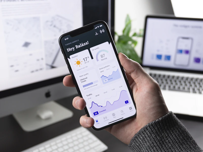
Catching flow issues before development — fixing them in Figma is far cheaper than fixing them in production.
Read moreFAQ
We can take a UI-only package if the flow is already clear. However, we recommend at least a short wireframe/flow step to avoid “pretty but hard to use”.
Ready to improve the experience?
Reach out to Dabilux and we will connect you with specialists who understand your industry best! 🔥
